

L’arte del vino. Il restyling delle nuove etichette Trerè
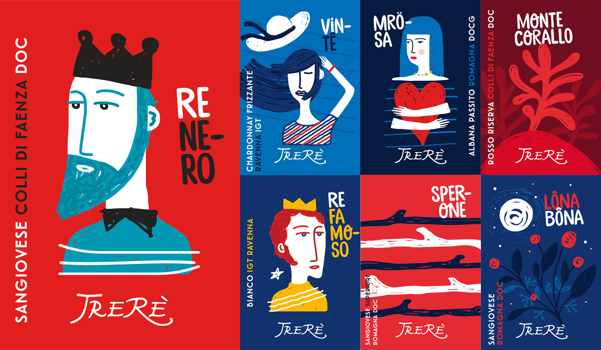
Ha nomi e volti nuovi il restyling delle etichette dei vini Trerè. Colori e tratti sono decisi, forti, iconografici e immediati. Per dare un impatto materico che ha lo scopo di riconoscere al vino il valore di essere esso stesso il frutto di un’arte. Un’arte che arriva dalla terra e passa attraverso il lavoro sapiente e appassionato di chi questo vino lo produce: una famiglia faentina che da tre generazioni porta avanti una ricerca mirata all’eccellenza della produzione artigianale. Da qui la scelta di uno stile distintivo e riconoscibile, che parla immediatamente di arte, e quindi anche di arte del vino. Per farlo con efficacia, ed aprire la strada all’immedesimazione, la tradizione viene illustrata con l’evidenza della semplicità: le radici restano, i codici cambiano. Attraverso un restyling mirato ad esaltare anche la passione e il gusto di piacere per ciò che si è, mentre si parla di creatività artigianale anche ad un pubblico giovane e di neofiti. Le nuove etichette portano nomi romagnoli che fanno eco a una tradizione consolidata, risuonando in un contesto visivo dove la spiazzante immediatezza del tratto ne aumenta riconoscibilità e carattere. A tutto vantaggio di una visibilità d’impatto, più forte e distintiva. Il tratto schietto è il modo più autentico di raccontare una passione diventata arte.
Ha nomi e volti nuovi il restyling delle etichette dei vini Trerè. Colori e tratti sono decisi, forti, iconografici e immediati. Per dare un impatto materico che ha lo scopo di riconoscere al vino il valore di essere esso stesso il frutto di un’arte. Un’arte che arriva dalla terra e passa attraverso il lavoro sapiente e appassionato di chi questo vino lo produce: una famiglia faentina che da tre generazioni porta avanti una ricerca mirata all’eccellenza della produzione artigianale. Da qui la scelta di uno stile distintivo e riconoscibile, che parla immediatamente di arte, e quindi anche di arte del vino. Per farlo con efficacia, ed aprire la strada all’immedesimazione, la tradizione viene illustrata con l’evidenza della semplicità: le radici restano, i codici cambiano. Attraverso un restyling mirato ad esaltare anche la passione e il gusto di piacere per ciò che si è, mentre si parla di creatività artigianale anche ad un pubblico giovane e di neofiti. Le nuove etichette portano nomi romagnoli che fanno eco a una tradizione consolidata, risuonando in un contesto visivo dove la spiazzante immediatezza del tratto ne aumenta riconoscibilità e carattere. A tutto vantaggio di una visibilità d’impatto, più forte e distintiva. Il tratto schietto è il modo più autentico di raccontare una passione diventata arte.
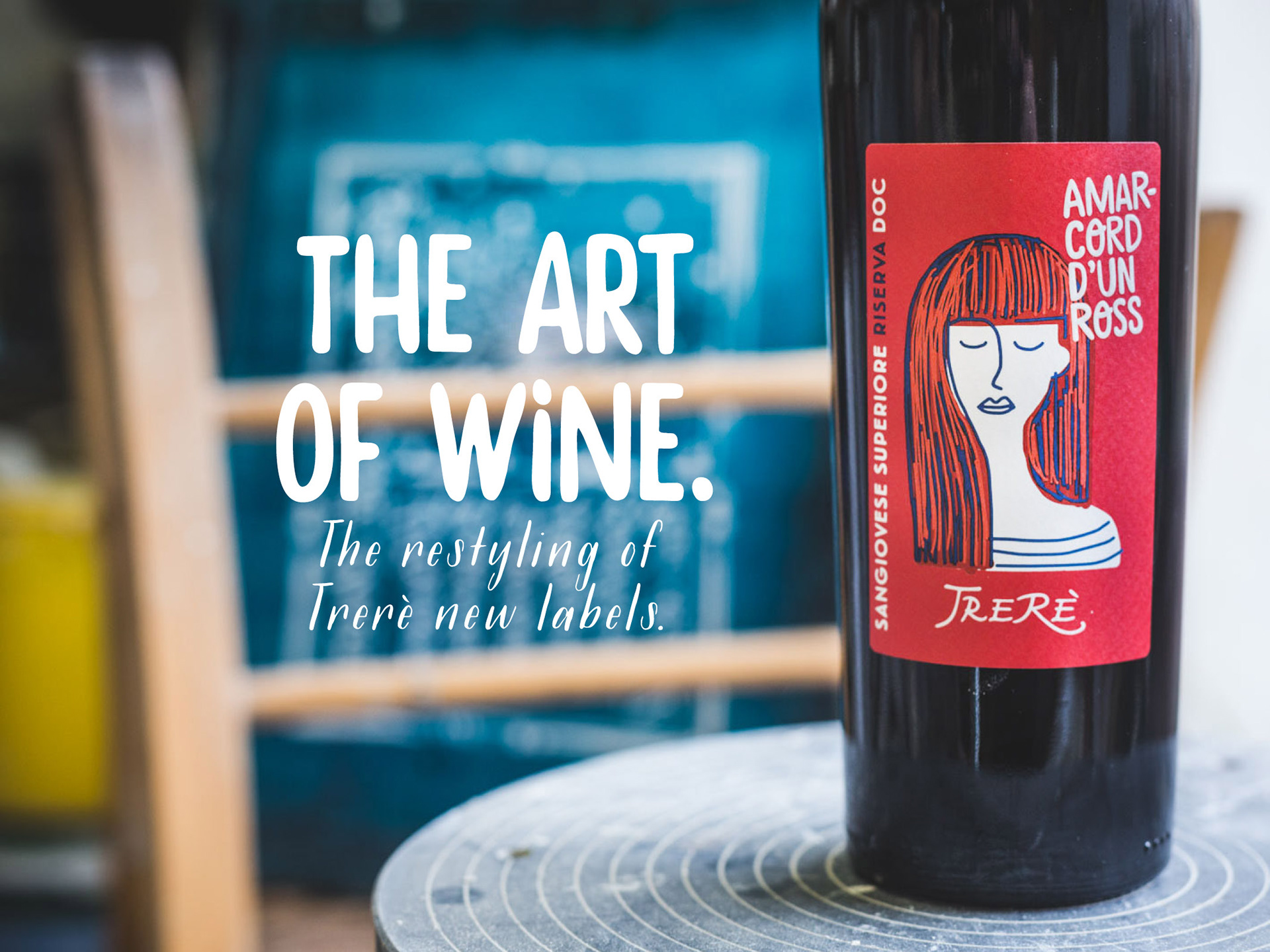
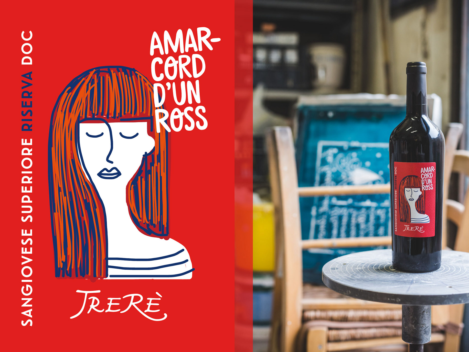
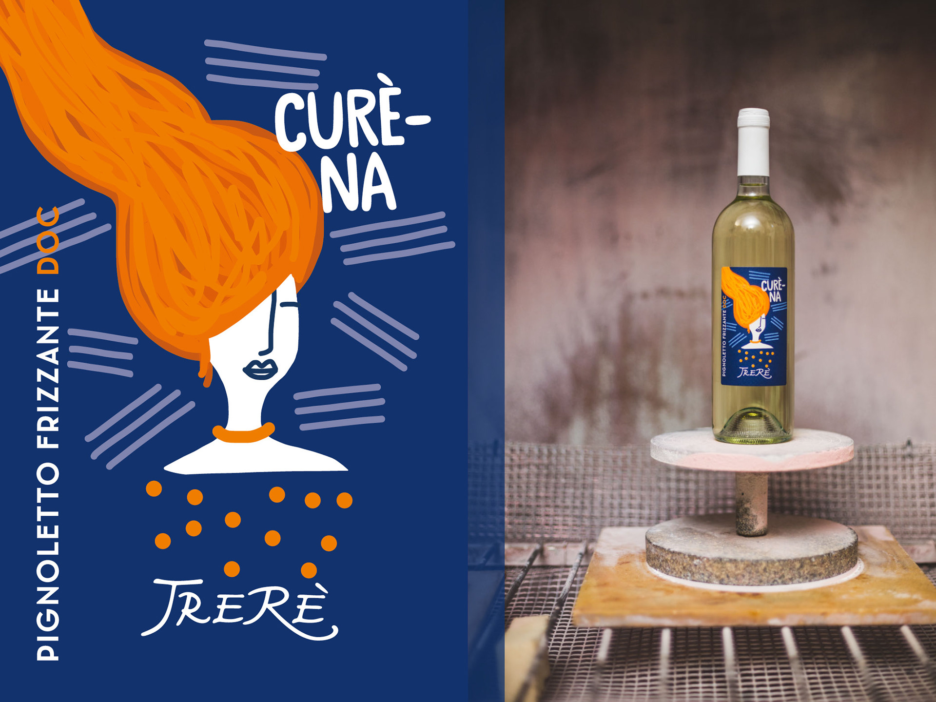
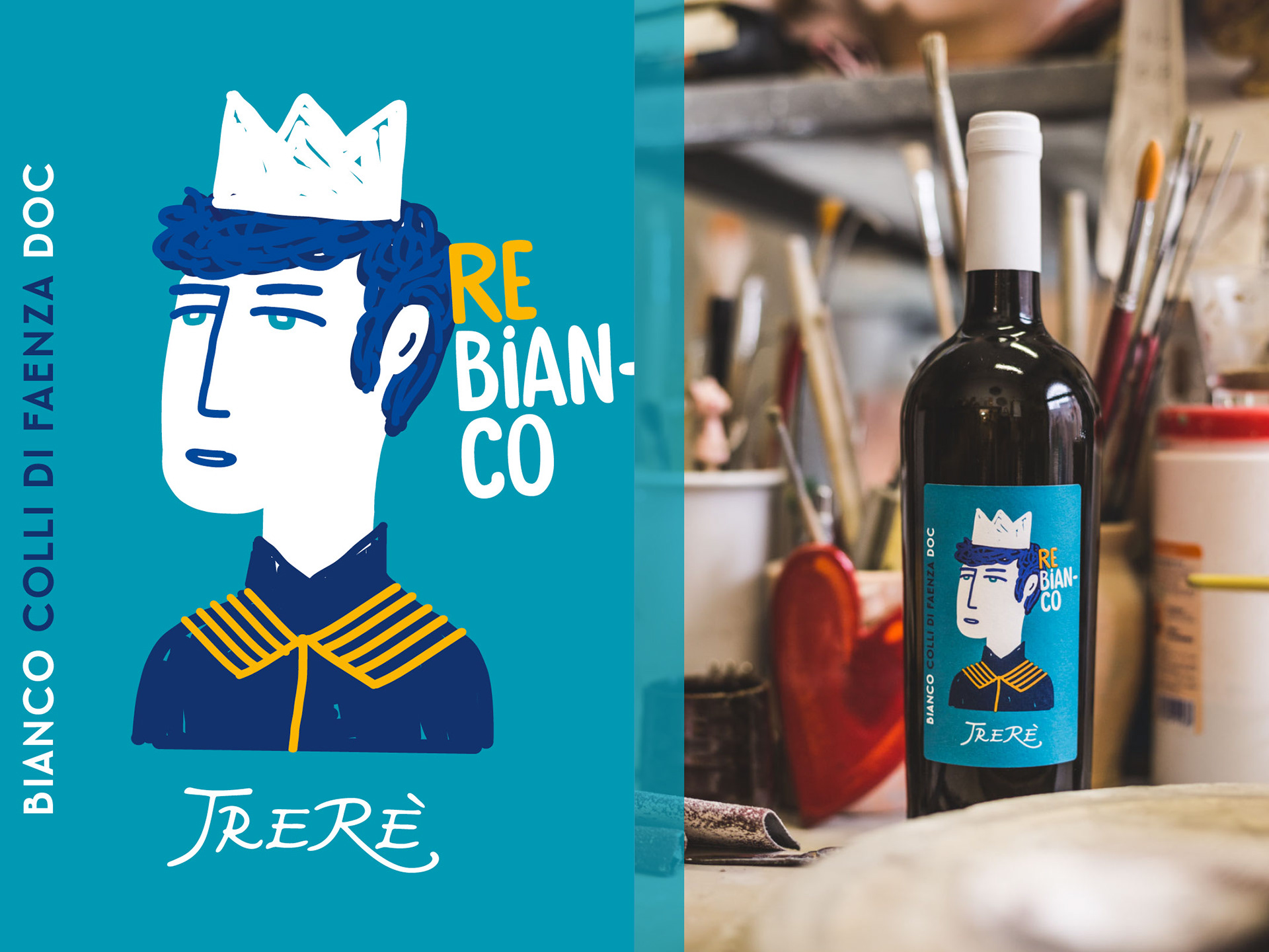
The art of wine. The restyling of Trerè new labels.
The restyling of Trerè wine labels sees new names and faces. Colours and traits are well-defined, strong, iconic and immediate. The aim: to give a visual impact with the purpose of recognizing that the wine itself is the product of an art. An art coming from the earth and passing through the wise and passionate hands of those who produce this wine: a family from Faenza who for three generations have pursued the aim of excellence in production. Hence the choice of a distinctive and recognizable style, which immediately speaks of art, and therefore about the art of wine. To do this effectively, and lead to identification, tradition is illustrated by evidence of simplicity: the roots remain but the codes change, through a restyling aimed at enhancing the passion and the taste of pleasure, while talking about a creative side also aimed towards young people and newcomers. The new labels have the names of Romagna that echo an established tradition, resounding in a visual context where the unexpected immediacy of the trait increases its recognition and character. This leads to the benefit of a stronger and more distinctive visible impact. The sincere note is the most authentic way to tell of a passion that becomes art.
Art Director / Graphic Design / Illustration: Jona Sbarzaglia
Photography: Gianluca Naphtalina Camporesi